Monday 4 May 2015

Studio Brief - Typography Choices

After experimenting with different colour variations i had to decide what kind of typeface to choose. I tried a lot of type face choice from Serif, San-Serif, script, decorative and modern styles. I wanted a typeface, which was modern to represent a modern and contemporary form of propaganda and also a typeface that communicate strength and is also impactful. Below are all the different typeface i experimented with.

In the end i decided to choose Gill Sans. The only reason for this was because it's the same typeface that the Green Party uses. I needed some form of Green Party branding on the design. At the moment the poster doesn't necessarily link with the Green party apart from the section at the bottom, so without this typeface then people might not make the link with between the Greens and the poster. It's important to keep with consistency and branding achieves this. Any other typeface then it would only be the logo representing the Greens branding, which isn't enough in the world of Brand guidelines.


Helvetica

Futura

Gotham bold

Garamond

Din Alternant

Century Gothic

Bodoni 72

Albertsthal Type

Final Typeface - Gill Sans

Studio Brief - Initial Ideas #1 (insert images)

Below are two concepts for the Greenpeace campaign that i will be representing for  my physical part of context of practise.

Whaling Concept

1 - This idea is more of an interactive idea. Instead of having your bog standard A3/A2 poster, i wanted the message to come to life and to really strike people emotionally. The design would be a dead whale printed onto the bottom half of the wall with Japanese fisherman standing onto of the whale whist proudly planting their flag into the whale. The tagline will read "one small step for man, one major regret for mankind" suggesting that we as human are hurting animals and are causing suffering. The interactive part will come in form of liquid blood. The room where the poster will be displayed,  hopefully i can make the floor of the whole room filled with red looking liquid all over the floor. When people go to look at the poster they instantly walk into a puddle of red blood. Making the overall idea, striking and emotionally hard hitting.

2 - Idea here is to show dead whales but in a large quantity. Having rows and rows of slaughtered, graphic images of whales would hopefully trigger emotional hatred towards Japan.The tagline here would be "Japan committing the sea life holocaust since 1956" suggesting that there is no difference between the two. Also furthering the hatred for Japan and linking in with the first point of Hitlers 5 propaganda guidelines.

3 - Japans other name is the land of the rising sun. Using this name with the image of the red sun with the star burst, i realised i could relate this to whaling. Having the rising sun for the background , with the silhouette of a whaling boat within the sun. Also the sea would be red to visually represent blood. Overall the whole design would link the land of the rising sun with whaling.

4 - Looking and researching into Japan as a country, i noticed that there land mass shape kind of looked like a whale. Taking this on board, i subtly changed the shape to fit more of a whale but still looking like Japans land mass. The tagline says " You are what you kill" suggesting that japan has been shaped by it's slaughtering of whales. This design at first glance is very subtly, but at closer look at the tagline the user should hopefully figure out the concept and to start asking themselves questions evolving round the topic.

5 - Idea here is to scare and exaggerate the truth with how Japan Carry's out there killings of whales. Image of the whaling boat on top of the sea. The boat shooting down a bomb to a number of waiting whales. The tagline reads "There is only a matter of time" Suggesting there is not a lot of time before the bomb goes off, which will lead to a collateral of deaths and even extinction. Exaggerating the truth fits in with rules of Hitlers propaganda and this will make people hate what japan is doing even though japan doesn't use bombs to kill whales.

6 - Whilst researching about whaling, i kept coming across images of the whales guts and their bodies formed into a square cube. It made me think what would people say if it was a human beings body and guts all squashed into a compact cube. Why is it alright to treat other animals in this way if we as human wouldn't approve if it was the other way around. The idea of showing this situations if it was humans in place of animals is the bases of this concept. First poster would be whales guts and body parts formed into a tightly compact square then another poster with the human taking the whales place. The tagline would read "whats the different?" Suggesting that there is not different between us and whales.

Shark Fining Concept.

1 - Shark fining is extremely cruel and i wanted to get this across to the user as explicit and emotional distressing as possible. Instead of using a shark with out a fin drowning in the sea, I will be using people. The people will be adults and children. People has a lot more emotional link to children, so would be more hard hitting. The idea would essentially be an adult or child with their arms and legs missing, slowing sinking to the bottom of the sea whilst still alive.

2 - Same as the previous idea above but instead of a single person slowing sinking to the bottom. The bottom on the sea floor will be lettered with dead people with there arms and legs missing. Linking to the what happen with all the discarded sharks left to rot and be eating by other animals. Hopefully i can not introduce a tagline so the image can speak for it's self.

3 - Displaying all the goods. Collection of arms and legs which represent the sharks fins which get sold on the market. Demonstrating that it wouldn't be acceptable for this to happen if it was the other way round. Hopefully the user would be disgusted and see the act of shark fining a disgraceful act of animal cruelty.

Studio Brief - Final Design

My practical for context of practise was based on the 5 guidelines that Hitler used on his propaganda. In my essay i mention these 5 guidelines as they were a good insight at how Hitler and also Joseph Goebbels created their propaganda and what aspects they deemed important, plus it's a good chance to get into their minds and see how successful their propaganda techniques were. The five factors were:


1.     Avoid abstract ideas and appeal instead to the emotions.
2.    Employ constant repetition of just a few ideas, using stereotyped phrases and avoiding objectivity.
3.    Put forth only one side of the argument.
4.    Consistently criticise enemies of the state.
5.    Identify on enemy for special vilification.


Producing my practical off these rules will make a strong link between my essay and the practical side. In my final designs, i have thought very carefully about each one of these points and to try and implement them into all three of my posters designs, whether it's obvious or subtle.

All 3 posters are off the same style and technique so i will go into depth and explain them all at once by analysing each point of Hitlers propaganda rules.

1 - Avoid abstract ideas and appeal instead to the emotions

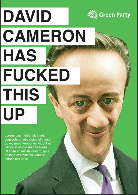
To directly appeal to the British publics emotions, i used a number of design styles and features to 
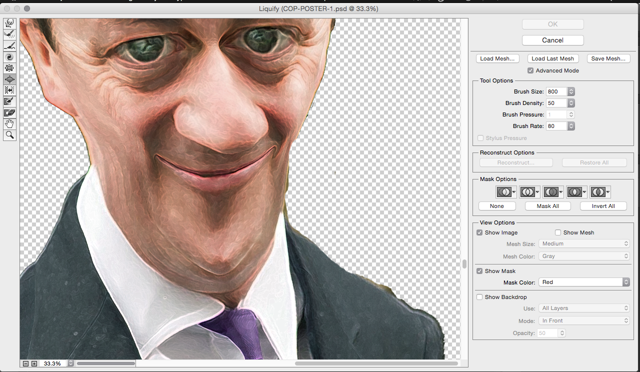
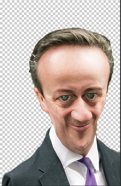
achieve this. Using a caricature style was a popular choice of propaganda for Hitler. Hitler used caricatures mainly on the Jews by distorting and emphasising their facial feature, which can be famously seen on the 'eternal Jew' poster, which I've analysed in my essay. By doing this Jews became more ugly, repulsive and sub-human. This led the German population to believe these lies, therefore tricking people into believing that you can spot a Jew by how big his facial feature are. The caricatures became truth for many Germans, who to them thought of Jews as disgusting rats who were untrustworthy and were the cause of Germany's problems. 

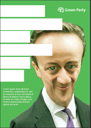
This is the reason why i decided to go for a caricature style in the Green party campaign. I want the British Public to have the same reaction as the Germans did, to not trust these three politicians and to see them as ugly, hideous and scary. In order to do this i emphasised the main facial features such as the nose, ears and chin all the same facial features that the Nazis emphasized on the Jews.  Having these caricatures will hit hard with the emotions of the Public, making them scared and afraid of the politicians, seeing them as ugly people who aren't to be trusted as a leader.  

Another aspect, which will also play on the emotions of the public is the tagline in all three of the posters. There are three key issues which the British public hates about our country and that the politicians won't do nothing about. These three things are, the Banks, especially the banker’s bonuses, right-winged parties and the energy companies. The public finds these things extremely unjust and causes deep anger in the pit of their stomachs. If any politicians are known to support any of these causes then the there would be public outcry, and that's exactly what i did. Having each one of these issues on each poster would infuriate people and hopefully cause emotional triggers, which will make the public go against these politicians and go in favour of parties that are against these issues. As you can see from the 3 taglines on the posters, you can grasp the reaction it may cause. I also used the word 'Sponsored' to add extra insult to the wounds as this suggest that these parties are funded and controlled by these organisations and people.
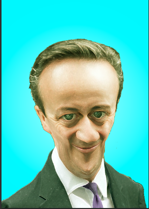
Colour is the final design feature used to cause emotion triggers, the previous design features that I've talk about like the caricatures and the tagline will all hopefully build up a great sense of emotional anger, So I've purposely used the parties colour scheme on each poster. Political parties all have a certain colour where by people can recognise them by. So with all this anger hopefully the publics subconscious mind will take in the colour and then every time they see that colours they will remember this poster and how distressed and angered they felt.

2 - Employ constant repetition of just a few ideas, using stereotyped phrases and avoiding objectivity.
The way i would show constant repetition is to print these posters out in large quantities. Even adding on a few more politicians like Nick Cleggs and Alex Salmon. Therefore it will link in with Hitler’s guidelines of 'employing constant repetition of a few ideas'. Using these posters in large quantities will start to subliminally manipulate and distort people perceptions and feeling against these politicians as Hitler once done in Nazi Germany. As seeing these posters everywhere and everyday, peoples will start to believe if repeatedly told about it. A lie can be shaped into the truth through constant repetition as Joseph Goebbels once put it ""It would not be impossible to prove with sufficient repetition and psychological understanding of the people concerned that a square is in fact a circle. What after all a square and a circle? They are mere words and words can be moulded until they clothe ideas in disguise" This is what I'm hoping would be the outcome of these posters and with the implementation of all design features discussed then i couldn't see why it wouldn't be as successful as Hitler’s propaganda.

Using stereotyped phrases and avoiding objectivity has been accomplished in the tagline. I don't actually know if these political parties have been sponsored by these organisations and issues, but what i do know is, I'm trying to inflict the most impact by slandering them and causing the public to turn against them. So by using stereotype phrases makes my message a lot more impactful to make people think about rejecting these parties and voting for the Greens who are in favour of the people of Britain.

3 - Put forth only one side of the argument.
It's clear to see how I've achieved only putting forth one side of the argument. All three taglines are all slandering and criticising these political parties without any chance of these politicians to explain themselves or any piece of information that could counter the argument. Therefor the British public will only see one side and will not be conflicted by other opinions that might give the other side of the story.

4 - Consistently criticise enemies of the state.
There are a lot of design feature and aspects within this design, which are criticising enemies of the state. The Greens rivals are the mainstream parties such as the Conservative, UKIP and Labour so in their eyes they are the enemy's of the state and it's up to me to make them enemy's of the state in the British voters eyes too therefore will discourage the public to vote for them.

The caricatures are making a mockery out of the enemy and making them look distasteful. The straplines is the strongest form of criticism. Making up lies and expressing how bad and un-trustworthy these leaders are. Also making up stories about the banks and energy companies will further the anger, which leads towards more outcry and disillusion in the public eye and then, that can be manipulated into the truth. If i had more posters printed out then i could then constantly criticise on a larger scale, which will make everything 10x worse.

5 - Identify on enemy for special vilification.

This point is already summed up in the seconds and forth point. But this point is about using abusively disparaging speech, similar to criticising. My tagline does exactly that. Expressing that these political parties are sponsored by these companies and sponsored by racism is extremely hurtful and damaging to their reputation and is a form of slander. It's abusing as its making fabricated stories for the benefit and gain of the Green party. These hurtful words will shape peoples opinions about them and eventually turn people against them. All these aspect are put in place to further the Green party cause and to discourage voters to reject mainstream parties.

Final 3 posters are below:


Sunday 3 May 2015

Studio Brief - Analysing Nazi and Contemporary Political Propaganda

Very modern form of propaganda by Hitler, normally most of Hitlers propaganda post are very traditional Germanic styles as Hitler rejected modern principles. The poster is very simplistic and modern. Hitlers has a serious pose which could communicate a strong leader. Anything to funny may be not be taken serious enough. The chose of black and white is again different to all the previous colourfully propaganda posters by Hitler. However using only B & W should allow the poster to stand out from the rest of the colourful posters.

Type face is modern, The top of the 'i' is unusual but could be a representation of Hitlers moustache showing a down to earth side to him.
This poster is all about glorifying Hitler. From his army behind him, the shin beaming out from the clouds, the eagle flying above, the glorious German landscape and the strong pose of Hitler holding the flag. All these aspects communicate strength, power and a born leader ready to take on anything.


The poster is just image based. The image is a play on the tagline. The image shows the pathway to what could be considered a better Britain. It's modern but the landscape could be better as a better example is of the previous Nazi propaganda poster. Modern typeface to represent a modern Britain. Union Jack to hit the emotional appeal with the patriotic people. Also it's just clarifying that the posters is about the British election as this link may not be clear enough without the appearance of David Cameron.
One of the most famous contemporary propaganda posters of all time. Obamas pose it one of confidence and optimism which could be a link to his countries future. This pose links perfectly with the tagline "Hope" nothing more needs to be said. Hoping for a better dream and hoping for a better America.

The use of a illustrative style is quite different for a modern piece of propaganda and the more favourable choice is realistic imagery. However this style is still contemporary and is setting a new example of modern propaganda and how success it can be.

Studio Brief - Colour Association Mind Map

To get a better understanding of colours and the different emotions and feelings that represent, i went around the studio and asked as many people how a certain colour makes you feel and made a mind map out of it.

This is the out come off four colour, Red, blue, Yellow and Green:

Red
Blue

Green
Yellow

Studio Brief - Visual Semiotics

Symbols and images are a great example of visual remembrance and semiotics. The Nazis' used a lot of symbol and imagery which have become the most controversial and recognisable symbols in history like the yellow star of David and the Swastika Hopefully in my context of practice i would like to see if i can implement any symbol that communicate certain emotions that will essentially make my propaganda more impactful. 

Viewing certain symbol can trigger feelings, emotions and awareness, this is due to constant repetition and associations, which is one of Hitlers propaganda guidelines. 

The MacDonald's logo is an amazing example of a famous logo which needs no title or introduction. The logo doesn't have much meaning behind it. It's only because the restaurant is in millions of locations, so the logo is highly recognisable. I suppose that a different kind of visual semiotic has been used here. One side is being visual due to emotions, colours and composition behind a certain image/symbol and then the other side, where something is meaning full due to marketing and repetition being constantly chucked in your face.
Even though the origin of this symbol meaning is fortune, luck and well being but due to association with WW2 its now been stuck with a bias connotation. To most people looking upon this logo it will trigger hate and disgust with a little bit of fear. Something so small and simple can mean so much, which is what visual semiotics is all about.
The next 3 images will look into expressions as forms of visual semiotic. Happy, sad and angry are all produced by the human face but each expression has completely different meanings, which can trigger different feelings and emotion.

These illustrations sum up perfectly what I'm trying to show. As I said above each expression is perceived differently.  For example, by showing a sad expression, designers would also add designs features along side to emphasis the expression and to show the hurt and discomfort. Using blue suggest loneliness and coldness, while red would be linked to angry due to the association with red being hot, tempered and dangerous. The other obvious feature would just be the expression on the face. If we was analysing a real person, you can examine the eyes, frown lines, nose, eyebrows and lips, these are all emotion triggers. 

Studio Brief - Advertising research

As i will be creating advertising posters for my practical side of context of practise, i thought it would be a good idea to analyse some ad posters and see the concept and message behind them

This advertisement for WWF is amazing well produced. It communicates the message extremely well. As soon as you see the gun on the child you instantly think, why? this in return gathers the attention of any body walking past.


Great use of gorilla advertising, Why restrict your self with just a digital image, bring your message to the audience directly and make them connect more with the issues.
.
This advert really connects well with the target audience You can tell the target audience is aimed at parents or any person who has children in their life. Looking at the ad triggers a parents instinct to protect their child and seeing this would obviously shock and disturb the audience. Which is what is needed sometime in order to get people to listen.


Using sex to advertise is very risky sometimes but if pulled of well can do wonders. I'm not sure if this works but it certainly gets peoples attentions as this kind of sex is not always aloud or acceptable in today's society. However it's basically objectifying women to make people buy their product. The message is saying, "buy this aftershave and you can have sex with girls" pretty tasteless.

Studio Brief - Colour Choices

Choosing the correct colour is extremely important to how the audience will emotionally connect and react. Based of my primary research it was determined that red is the most sinister colour and causing images to become more distressful. However there will also been some conflicts with colour, due to branding and the colour misrepresenting something else.

Below are the following analysis and my though process through the different colours.


Light colours

Light colours were used to make the caricature stand out. The more the poster stands out the more attractive and appealing the poster will look to other. However light/cool colours are associated with positive feelings, which is something i don't want this poster to represent and according to my primary research on light colour, they can make an image less negative. 

All so, having an appealing poster is effective but in this scenario it's not. I want the poster to communicate a negative message about these politicians and making it look 'cool' and 'appealing' is contradicting.

Blue makes the image appear in a positive light, it comes across fresh and makes Nigel Farage look humorous instead of an un-trustworthy leader. Also this colour represents the branding of conservatives, therefore people might get confused.

Orange is the same as the blue, making light of the situation.

In my primary research yellow was the colour that desensitises an offences or sad image so this wouldn't be appropriate.


Dark Colours

Dark colour are well-known for making an image more scary and sinister, especially red. Red is associated with danger and warnings, so in theory this colour would be perfect.


Red would be a perfect colour if it wasn't the colour of Labour. I don't want people to accidentally get confused between Labour and UKIP. People might think this is a campaign against labour. Also if i use red for one then ill have to use red for all three poster as red is the perfect representation of what i want to communicate, which is danger and a warning, but if they were all red then it would just look like a hate campaign against labour and not necessarily with the other parties.
Black can be seen as a scary, demonic and evil colour but on this image, it reminds me of a photo shoot therefore making light once again of Nigel Farage instead of making a negative impact.


Unattractive Colours

In Hitlers famous poster the 'eternal Jew' they used ugly, un-attractive colours, which made the overall image look more disgusting and dirty to look at and only emphasised the effect of degrading Jews. This is what I'm trying to do with the two colours below. They defiantly do the job of making the image more distasteful and unattractive but because the Greenpeace logo and tagline is on there then people might think that the Greens are an unattractive party, even though their is a picture of Nigel Farage on the page. If the Greens branding wasn't on the page then these colour would work to the maximum potential. But voters might link the ugly colour and the Greens as one, which will have a negative impact.


Branding colour

I also tried Greens party colour as the background to make more of a link towards the Green party. At first i thought this colour was appropriate as voters can easily make the link between this poster and the Green Party. However, once i stepped back and asked a few people their thoughts, it became apparent that the tagline may make people think that the Greens support the tagline. Essentially I'm putting the branding around a message about hate which looks like a seal of approval. This will bring negative publicity and be a complete opposite to what I'm trying to do. Also as green is a light colour, the image isn't as distressing as i would like it to be. With all this in mind i decided not to have this background colour.


Final Colour
 The final colour i chose for all the 3 posters was the parties associated colours. So Purple for UKIP, Blue for Conservative and Red for Labour. Even though some of these colours come under the 'light colour' category, I hope to counteract the positive feelings these colours communicate.

I chose the political party colours because i want the public to view this poster, which is meant to produced emotional triggers for that party then subconsciously have that colour stuck in their mind so they wouldn't forget. Even days down the road and if they see this poster over and over again they may start associating this colour with hate and in this case 'bigots and racism' which will evidently counteract the positive aspects of these colours.


Studio Brief - Design Experiment/Development #1

Below is the first try at doing caricature in Photoshop. I didn't know if it was possible to do an effect job in Photoshop. Here was my first attempt and some development through the stage and also what went right and wrong.


First off i had to get an image of David Cameron. I didn't know what image in terms of positions and angles to get him at but i knew i probably wanted a image of him smirking, laughing or looking smug as i would take this facial expression and use it against him.

I kind of knew about the Liquify tool before and the kinds of distortions you can do with it. So i choice Liquify to transform David Cameron's face into a caricature. ( The Liquify tool is in under the 'filter' tab)

This was the view once you open liquify. You can see that I've already started working on distorting and emphasising the facial features.

This is the liquify tool bar. The main 3 tool is use in this bar are: top - this tool drags the skin, so is you want to make the nose, chin or face longer then you would simply drag these features to make it longer. 5th down - this tool shrinks objects. So if you want to shrink someones any facial features to make it appear smaller then you would use this tool. 6th down - This is the opposite to the shrink tool, this tool is used to bloat objects. So if you want to emphasis any feature then you would use this tool.

This was the outcome of the first Liquify try. I went along with how the Nazis' made their caricature, so seeing what facial features they emphasised and what part they didn't. In the end i emphasised the nose, eyes and forehead. I make the overall face a lot longer which made him look like a freak and more scary to look at. I also applied Photoshop filters to make David Cameron look more like a cartoon to fit how the Nazis' did it. Also by adding filter you can hide any mistake or pixels that you've stretched to much by distorting the face too much.

I then started applying different colours in the background to see what looked the best.

I added the colour green in the background the represent the Greens branding along with the Green party logo. 

I quickly mocked up a tagline and a small body copy to see how everything would all look. 

This was the other tagline used within the design as another option from the large lettering. This tagline is meant to link in with the caricature, as David Cameron look more ugly and evil, the tagline suggests that you should kick the evil out of Westminster as they can't be trusted.
Overall, I wasn't a fan of the outcome that i have produced. I felt that a profile shot of David Cameron wasn't as effect then a side shot. With a side angle you can emphasis and add more depth to the photo by making everything longer and bigger. The colour background wasn't exactly appropriate as by using the branding of the Green Party, people might assume a link to tagline to the Green party instead of linking it back to the conservative.

Studio Brief - Interim Crit

Today we had our first interim crit for cop. At first the group liked my idea based around the Greenpeace campaign. As i was explaining the link between my essay and the piratical and how I'm going to base my practical around the guidelines that Hitler used in his propaganda, they all liked this aspects and said it was a good link. 

However, after the crit, i spoke to Simon about my idea as I wasn't sure if the link to my essay was strong enough to the political propaganda used in Nazi Germany. Simon suggested that i maybe try to represent a modern political Party instead of going down the activist route. Greenpeace campaigns have been done so many times before so it wouldn't necessarily be unique or be a major issue that the British public cares about.

I totally agree with these point that Simon made. I feel like with the political advertisements i can quite easily base Hitler guidelines more effectively and then try to see if i can achieve what Hitler did, by manipulating and distorting peoples views and opinions by using emotions, repetition and criticising enemy of the state, which is all something i could do with the Greens.

Studio Brief - Initial ideas #2

After Simon suggested to me in the interim crit that i should maybe consider trying to go down the political route instead of working with a Greenpeace campaign, I decided to sketch some ideas and see what ideas i can come up with. 

I decided to represent Green party for my ideas as Green party is a modern political party who are starting to make an impact in British politics. Also other mainstream parties such as Conservatives, Labour and Liberal democrats have all been done before therefore i could get more uniqueness with the Greens.


Natalie Bennett will be the main feature of this idea. It will be in the similar style as the 'es lebe Deutschland' (below) poster produced by the Nazis' which glorifies Hitler in all aspects like his army behind him, ideal German landscape and the eagle flying above. Natalie Bennett will be in the same scenario but without the Nazis' branding in it. Natalie will be there with the green, English, organic landscape with the light shining perfectly on her and maybe a group of green party followers behind her to represent the support of the green party which will make her look like strong leader  


I think this idea represents the concept the most and makes the link between the essay and practical . This idea is playing on peoples emotion and turning them against the mainstream politicians. The poster will be off one of the politicians as a caricature. Caricatures were used a lot in Nazi propaganda and have been used to manipulate people into thinking that what they see in the caricature is truth. They used it a lot against Jews to change their facial features.

In this example, it's David Cameron. I want people to see this caricature and start to see it as truth. burning the image into their head in till they believe it. Therefore making that person more ugly and un-trustworthy as a leader. 
Idea here is meant to take the common phrase but changing it to benefit the Green party. So the British nation anthem 'god save our gracious queen' has been change to Greens instead of Queen. This aspect communicates that the green party are all for the British people and they need the public to see how important their cause really is. The style is contemporary and simplistic.


This idea is based on a contemporary style. There will be around 5-6 un-flattering images of David Cameron with the tagline 'don't vote for Cameron' The user is meant to see the images and become put-off and disgusted by the look off David Cameron and the tagline is meant to help this message. I want people to think 'do i really want to vote for this person'.