Below is the first try at doing caricature in Photoshop. I didn't know if it was possible to do an effect job in Photoshop. Here was my first attempt and some development through the stage and also what went right and wrong.
 |
| First off i had to get an image of David Cameron. I didn't know what image in terms of positions and angles to get him at but i knew i probably wanted a image of him smirking, laughing or looking smug as i would take this facial expression and use it against him. |
 |
| I kind of knew about the Liquify tool before and the kinds of distortions you can do with it. So i choice Liquify to transform David Cameron's face into a caricature. ( The Liquify tool is in under the 'filter' tab) |
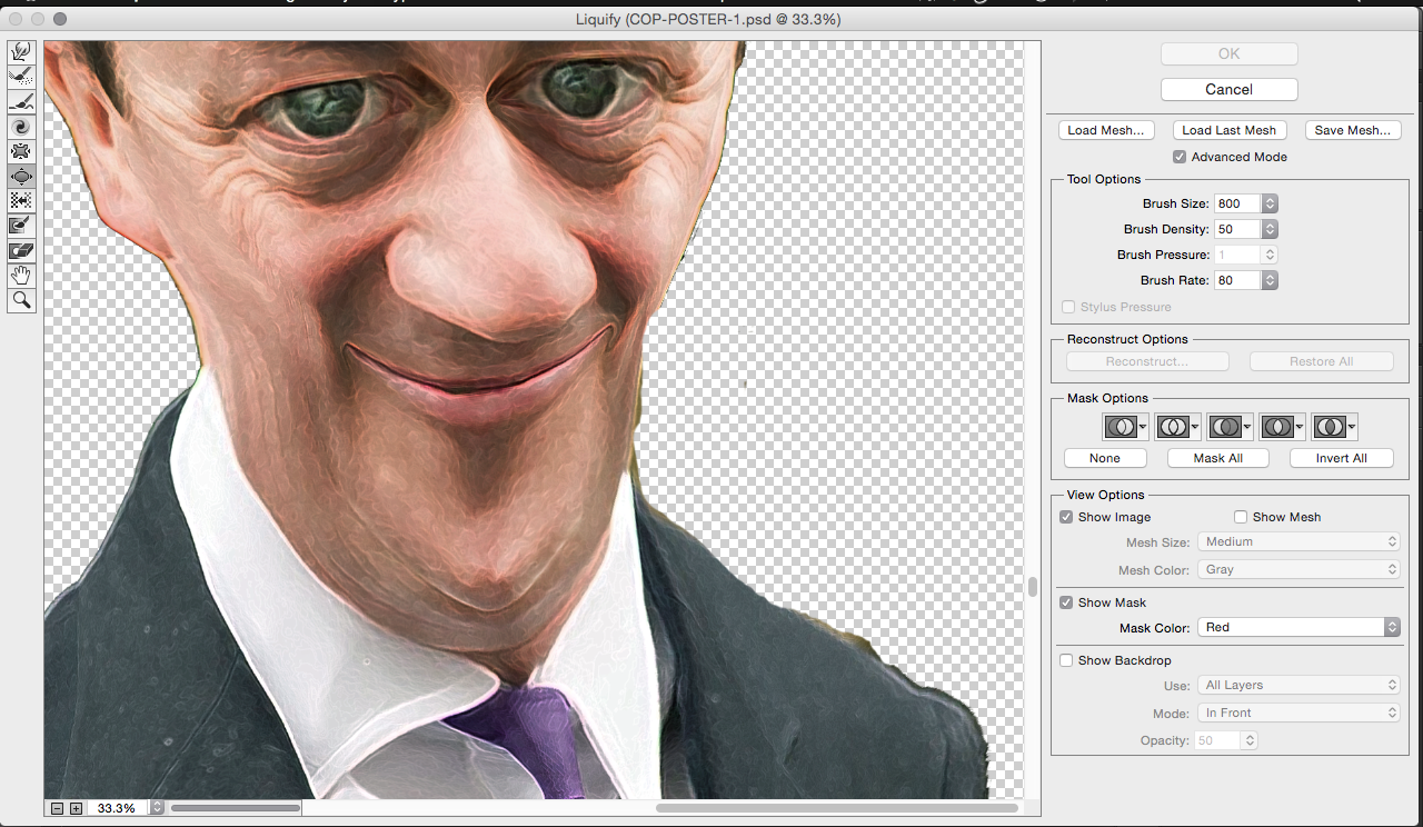 |
| This was the view once you open liquify. You can see that I've already started working on distorting and emphasising the facial features. |
 |
| This is the liquify tool bar. The main 3 tool is use in this bar are: top - this tool drags the skin, so is you want to make the nose, chin or face longer then you would simply drag these features to make it longer. 5th down - this tool shrinks objects. So if you want to shrink someones any facial features to make it appear smaller then you would use this tool. 6th down - This is the opposite to the shrink tool, this tool is used to bloat objects. So if you want to emphasis any feature then you would use this tool. |
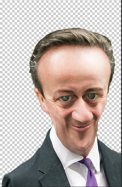 |
| This was the outcome of the first Liquify try. I went along with how the Nazis' made their caricature, so seeing what facial features they emphasised and what part they didn't. In the end i emphasised the nose, eyes and forehead. I make the overall face a lot longer which made him look like a freak and more scary to look at. I also applied Photoshop filters to make David Cameron look more like a cartoon to fit how the Nazis' did it. Also by adding filter you can hide any mistake or pixels that you've stretched to much by distorting the face too much. |
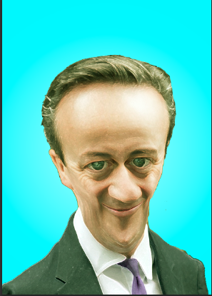 |
| I then started applying different colours in the background to see what looked the best. |
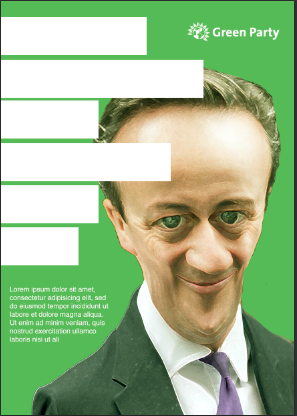 |
| I added the colour green in the background the represent the Greens branding along with the Green party logo. |
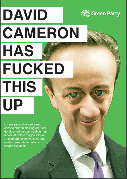 |
| I quickly mocked up a tagline and a small body copy to see how everything would all look. |
 |
| This was the other tagline used within the design as another option from the large lettering. This tagline is meant to link in with the caricature, as David Cameron look more ugly and evil, the tagline suggests that you should kick the evil out of Westminster as they can't be trusted. |
Overall, I wasn't a fan of the outcome that i have produced. I felt that a profile shot of David Cameron wasn't as effect then a side shot. With a side angle you can emphasis and add more depth to the photo by making everything longer and bigger. The colour background wasn't exactly appropriate as by using the branding of the Green Party, people might assume a link to tagline to the Green party instead of linking it back to the conservative.


No comments:
Post a Comment