Sunday 24 April 2016

COP2 - Module Evaluation

Context of practice as a module had been very challenging but very rewarding. Time was the biggest issue when it came to completing short deadlines and the module deadline in the end. This was partially due to the fact that other modules needed more time and effort to be put into them. Responsive module was the only module that put me on the back foot and made what time I had left extremely valuable. However, due to hard work and a good understanding of my research question I knew what I wanted to do and how to achieve it and eventually coming up with a strong conceptual final resolution for the campaign. Phonebloks smartphone gave me such an opportunity to created something creatives and imaginative. Ideas upon ideas rang through my mind with the construction and customisability of the phone that only helped me speed up my work management abbd helped me make up loss time. The only downfall with Phonebloks was the fact that it’s a modular phone. Modular phones are very new to the tech industry and very rarely heard off in public. Therefore, there was no existing advertising material for modular smartphone. In a way it acted as a gift and a curse. It meant that I truly had to understand what a modular phone was and to learn the benefits and how it’s constructed. The best part was the flexibility. I was essentially advertising a revolutionary phone that could potentially changed the way we see smartphone in years to come. It was exciting to know that I had complete freedom to promote modular phone in any form I wanted too. 

The main benefit I found with this module is being able to apply existing skills and knowledge that I learnt from other modules and developing them further for context of practice. The isometric typography and illustration that I created for responsive was the perfect fit for cop. As I was working on both modules side by side I could see how the Isometric grid linked and represented both briefs I was working on at that time (Penguin & cop). The isometric grid represented a block-type structure and that’s the potential I saw in the isometric grid. Phonebloks was a phone that was build like an isometric grid. With its block-like construction, Isometric grid was the perfect tool to implement within the campaign for Phonebloks. 

I found feedback very beneficial and constructive. Without the feedback I would have blindly created something that I personally liked but it would’ve of appropriate for the brief. Simon gave me such an important issue to think about. It was something that I knew deep down I was doing but didn’t want to admit. Simon made me aware that I was approaching the brief from viewpoint as a designer and not from an advertising perspective. Even though I loved the current set of adverts at that stage, I knew I had to change them and start to think from the viewpoint of advertising in order to improve the quality of my work.


Lastly, implementing the eight hidden needs within my campaign was a challenge. From the start I always had it in my mind that I was going to somehow implement all eight desire into the adverts. But I came to realise that this wasn’t possible. I explained the reason for it in my blog but I only chose desires that I felt were appropriate and in which made my concept stronger. I didn’t want the risk of destabilising the concept by trying to embed all eight needs within it. In the end the module started slow but very quickly built up momentum when the deadline approach. I felt I handled the workload well and managed to produce a series of adverts that clearly linked my research question and practical in harmony.

COP DESIGN BOARDS


COP3 Proposal

https://issuu.com/jacksolomon9/docs/issuu_-cop3_proposal_a2a73ae3e284c3/1

COP2 - First Mock up

This is the first mock up of my first idea that I sketched out. I decided to use realistic photographs to maximise the emotional appeal towards the audience. Real life photos are relatable and is something that the user can connect with on a personal level. I used two photos for each poster just to double up the visual attraction of the posters and to incorporate a contemporary style within it's aesthetics. Using a contemporary style within the poster allows for the campaign to feel relevant and up to date demonstrating the attributes of the phone as being a new piece of technology ahead of all the other competitors. 

Image, colour and text have all been chosen to maximise the implementation of the hidden desires. All of these adds uses 6 hidden persuaders out of eight.

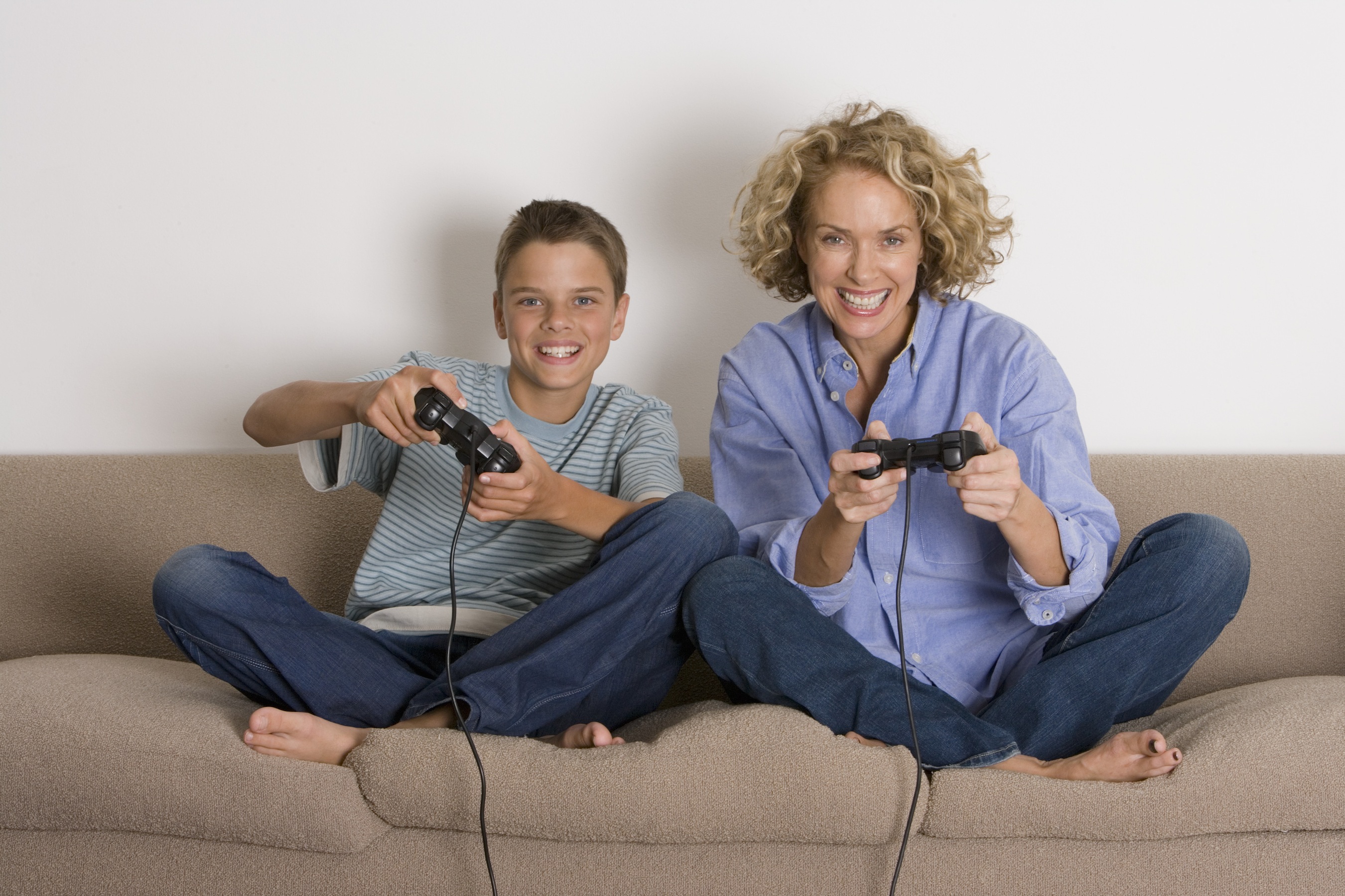
Emotional security has been embedded by the use of images. Images of a mother holding her baby and the image of the grandparent with his grandchildren demonstrates a hold on their loved one. The audience seeing this image would want to buy the phone to preserve and capture their family. Reassurance of worth has been implemented by the wording of the posters. By using "for the adventurer", "for the gamer" it tells the consumer that they can be the adventurer they always inspired to be and they can achieve that dream of becoming a professional gamer. They are worth these achievements in life and Phonebloks will help them achieve that worth. 
Selling creative outlets has been achieved by the concept of the campaign. Giving the users the tools to build their own experience with the phone indicates a creative approach that is unique for every user. 
selling love object. Implemented by the use of images. Using images of objects and people that the users love the most. Children, grandparents and even gaming consoles are things that people love the most, therefore users will buy the phone to capture and store memories and moments. 
The last desire is immortality. This is demonstrated on the first and last poster, again by the imagery. The young faces and healthy looking young people make the user want to buy the camera to portrays this look or experience. The baby will also portray a sense of internal youth making the user feel younger.


COP2 - Idea 2 Continued

From the previous blog post about my second idea with the isometric illustrative camera, this blog post is essentially developing that idea. When reviewing the design I wasn't happy with how it looked aesthetically and conceptually. The poster looked dull and a copy of Lego's artwork, it reflected an unoriginal piece of work and that is something I don't want to associate myself with. I wanted to create a poster that represented a contemporary style while representing the core ethos and the tech industry Phoneblok was within. Creating a contemporary style demonstrates the forward thinking side of the company, a revolutionary company that is miles ahead with it's competitors.

With this in mind, I wanted to take the existing poster and essentially make it more modern with aesthetics of a technology company.

Existing Poster


From the changes below you can see the changes that have been implemented within the new design. I've reintroduced the different colours from my first idea as I felt it was important to embed colour within the design to strengthen the informed design decisions and also the emotional connection with the messages of the posters (e.g adventure, battery and Gaming).  In the previous idea the typography didn't draw the audience in and capture their attention. The type face and layout lacked real purpose within the overall hierarchy and architecture of the poster. To get the type to represent Phoneblok the type was created and formatted in the same way as the isometric illustrations. The illustrations emit Phonebloke as a technology smart phone that is essentially made up of parts. I saw the potential of the isometric grid, so I wanted to reflect this for the typography. As the you see from the updated example the text has been created with an isometric grid as it zig-zags down towards the page. The design decision for the zig-zag text is that it leads the users eyes down the page making sure the user covers all important areas of the advert. 

Lastly, I changed the illustration of the camera to just outlines. In order to fit the text and camera within the poster, the text would have to overlay the image because of size and readability. However, the type looked awkward and visually unpleasant. Therefore, I outlined the camera to give both more breathing room. All design features on the page reflect a contemporary style. Overlapping text with a gradient background is a current trend within graphic design so I wanted to take advantage of the trend to demonstrate a company who was ahead of the rest in terms of technology breakthrough. Even with the contemporary looking design the overall aesthetics still reflect a technology style, almost reminding me of booklet manuals you used to get with a PC


COP2 - Idea 2

As my first idea didn't quite work out for me, I proceeded onto another idea I had sketched out earlier. This idea is based around the Lego campaign (I discussed the Lego campaign in another blog post). The Lego campaign to me captured the essence of what It meant to be creative and imaginative. Using the imagination to create endless possibilities and that's what Lego is trying to express with their adverts. The idea of looking beyond the inanimate object to see the possibilities that come alive in the users mind and this is what I'm trying to communicate within this idea.


Lego


For the previous idea I used photographs to represent the text within for each poster. For example "A camera for the adventure", "bigger battery for life's moments" and so on. Instead of photographs I decided to create isometric illustrations to represent each piece of text. The style and aesthetics of the illustrations link heavily to the way Phoneblok is designed and build. Phoneblok has a brutalist/block-type style with a neutral colour scheme and this is the kind of style I wanted for the illustrations. For the text "A camera for the adventure" I created a camera for this text.

The illustrations were also created within an isometric grid to represent the phones structural properties. Creating illustration within an isometric grid is a skill that I learnt in the responsive module while creating a book cover for A Clockwork Orange and I saw the connections between the two briefs, which is the main reason for using the grid.


This is the camera being created within the Isometric grid. 


Once the camera Illustration was created I then proceeded to mock it up within a poster form to see how it will look on the page. To represent what I had seen on the Lego adverts I wanted to replicate that in some form on the posters. I wanted users to see the creative potential Phonebloks contains. It's not just a phone but it can be whatever you want and whenever you want, all you need to do is build for any occasion as the tagline suggests. The camera is essentially demonstrating what the user can turn the phone into hypothetically if the user needs a better camera. But to further the creative appeal I needed more then just an illustrative image of a camera. Therefore, similar to Lego I created a shadow of the camera that form into a mountain with two people at the peak. This reflective shadow demonstrates the need for the camera. Essentially the camera and the shadow both play important rolls within the posters to represent the concept of a buildable phone to enrich peoples lives. The camera is representing what the phone can be used as and the shadow coming off the camera explains to the user what scenario they could use the camera for. The mountain peak also demonstrates an imaginative appeal, directly appealing to the users creative outlets, imagining what adventures they could go on if they had Phonebloks.

Implementing 8 hidden needs

In the previous blog post about my first idea I gave an insight into how the hidden needs have been strategically placed within the add to maximise the appeal for the consumer. As this idea hasn't necessarily been completely changed some desires are still in place within this idea. However, the main concern is the fact that I've removed the photographs. The photographs contained a lot of the hidden desires within them, such as Immortality, security and worth. This is because photos say a thousand words and can emotionally appeal to the users directly. Users can look at a photograph and see the story and hidden meaning behind it and you just can't get that with illustrations or text. Illustration are very subjective, the user has to interpret them in their own way and sometimes if the illustration aren't clear enough then the message can become lost. This is a big concern when it comes to how well this idea uses the 8 hidden needs to strengthen the concept and persuade and influence the consumers to buy the Phonebloks. However, this is something that needs further investigating and testing to truly discover if the adverts work or not.


COP2 - 8 Hidden needs

My essay is universally based around how the eight hidden needs/desires are still being implemented within contemporary advertising. So to make a connection between my essay and practical crystal clear, below are the eight hidden needs that I will being implemented with my advertising campaign for Phonebloks. The main issue that arises is whether or not I can use all eight within my campaign. After researching a number of adverts for my essay and practical it was clear that not all can be embedded into one advert. This is due to a number of reasons like the amount of elements that need to be on the advert to cover all needs, as you can't only have an image and text that covers all desires. Another reason is that some desires repel against each other. For example love objects and ego-gratification and also roots and power are polar opposites of each other, therefore the advert will either have to use the desire of love objects or power but not both.

The only way to insure the eight hidden needs to be used is to create a series of adverts that have the same uniformed theme and concept but image or text interchanging to make sure all needs have been implemented.

8 needs are:

  • Emotional security
  • Reassurance of worth
  • Ego gratification
  • Creative outlets
  • Love objects
  • Sense of power
  • Roots
  • Immortality


COP2 - Final Resolution

Below is the final resolution for the advertising campaign of Phonebloks. After taking in the feedback from Simon and then conducting a number of primary research tasks I managed to successfully implement the selected full bleed images within the series of three adverts. The overall aesthetics of the design communicates Phonebloks as a modern tech company who are revolutionising the way we see smartphones. I was debating whether or not the use the isometric type for the informational text, I decided to use it in the end as I thought it brought the design to life visually as it adds a unique and creative approach to the advert. The type also reflects the phone in a contextual manner by representing the way Phonebloks is structurally built. The tagline had been changed from 'For any occasion' to 'Build moment'. 'Build moments' emphasises the concept within two words instead of three and the new tagline is a lot stronger to read with nothing left to the imagination. 'For any occasion' lacked importance and appeal, therefore 'moments' was used to emphasises how Phonebloks can enrich the consumers life for the better. Lastly, as modular phones are relatively new to the tech industry it means that these posters could be the first time the public would of heard of an modular phone. To make the public aware in case they become confused the design uses a couple of lines of information to quickly summarise modular phones and the benefits of using Phonebloks.


How have the hidden persuaders been implemented?


Emotional Security - Imagery and text have been used to create the desire of emotional security. Emotional security is about embedding a sense of safety and comfort into a product in which the consumers feels as if they have to buy that product in order keep them or their family safe. The text in the posters embeds a sense of security, especially the second poster about 'a bigger battery for life's moments'. Using the second poster as an example, it suggests that in order to remember and capture the most important memories of their family they will have to buy the camera in order to photograph them. The word 'battery' has a deeper meaning under the surface. Battery relates to time and that time relates to how long you have to spend precious time with your loved ones. The poster will instil a sense of subliminal panic that the consumer must purchase the camera to remember these moments as life is short and precious. The overlay colour of red and the image of the couple at their wedding only intensifies the desire and gives the consumer an example of when they had a life moment such as their wedding and how important it was for them to be photographed on their special day.

Reassurance of worth - The desire of worth has been widely used on all three poster by the information. Every message in the set of posters demonstrates that the user is able to achieve anything with Phonebloks. Phrases such as 'for the adventure" and 'for the gamer' communicates to the user that with Phonebloks you can achieve your dreams and be what every you want to be, embedding a force sense of worth that they are capable of doing anything but only with Phonebloks. Similar to the previous need the overlay of colour and image intensifies the desire by giving them a reference to look at, seeing these people in the images with their exaggerated facial expressions happiness and enjoyment, making the consumers want to reflect these emotions into their own life.

Creative outlets - Phonebloks emits creativity and imagination in such ways as Lego does. The product itself is a creative outlet where the user can upgrade and personalise the phone by adding and removing the blocks. The possibilities for the user are endless, all the consumer needs to do it apply their imagination and creativity and the phone is what they want it to be. This is evident in my poster by the message they process. Key phrases such as 'a camera', 'bigger battery' and 'a console' all demonstrate the different ways Phonebloks can be constructed and turned into. The small icons above the logo will quickly indicated the number of ways the phone can be build into. 

Love objects - Love object is a desire where the user can invest their love, time and money into a product. The advert sells this needs by implying that Phonebloks is designed and made for them by the messages they express. Phonebloks is completely customisable, insuring a personal smartphone for each user. By embedding this sense of a personal experience the user would feel more connected and would invest into something that they can call their own unique product in which no other user has.

Immortality - Immortality is essentially the need for internal youth, a product that the consumer feels can give them a sense of long jeverdy. The adverts implements these factors by only using young people in all the images, which the user will subliminally think the product can imitate for them. The Phase 'big battery' can pragmatically convey long jeverdy and a chance to extend life, this also relates to immortality.


In the end the adverts only implement 5/8 desires. I didn't want to over complicate the advert just to fit all 8 needs within the campaign as this would be unprofessional and could potentially destabilise the whole campaign. I've explained in the "8 hidden needs" blog post about the challenges of using all eight needs so I knew that it might not be possible to use them all. In the end I decided to choose the needs that were appropriate for the campaign and left out ones that didn't strengthened the design.


Even though 

COP2 - Research Into Smartphone Competitors

The smartphone market has been predominantly controlled by Apple's iPhone and Samsung's Galaxy since the boom of the touch phone. To understand how they promote their smartphones I will be analysing their adverts for their newly released smartphones to understand the design decisions and concept behind the advert. In doing this I can begin to apply some design and conceptual techniques used for the promotion of the iPhone and Samsung Galaxy for Phonebloks.

iPhone 

Apple has always been ahead of the rest of the smartphone market in terms of revolutionary design and aesthetics. Apple has a large loyal fan base of designer and creatives who are dedicated to purchasing all things Apple and that's purely down to the way the iPhone looks and the way Apple takes design so seriously. 

In the advert below the aesthetics of the poster is minimalistic and modern, communicating a professional and visually appealing advert. Apple leaves everything to the imagination when promoting the iPhone. The slick modern style from the light neutral background and san-serif typeface demonstrates an almost tranquil mood, emitting wonder and creativity. The style and aesthetic of the design is the core reason why Apple has a large creative following because creatives appreciate well executed design. The term 'bigger than bigger' inserts curiosity and anticipation into the audience. The tagline is essentially saying that the new iPhone 6 is bigger then you can imagine, keeping the audience interested till the release date to see if the phone lives up to the hype. 


The next advert below by Apple communicates a feature off the iPhone and not the product itself. 'Shot on iPhone6' is a promotional teaser demonstrating the high quality performance of the iPhone 6 camera. This advert is directly appealing to photographers and others who are interested in that discipline. It demonstrates other areas of the phone and not just a phone that you make calls and text from. By using stunning visuals for the advert the user would be inspired to recreate what they have seen, knowing that they only need the iPhone to created visually beautiful images ending the pressure and stigma that you need to spend thousands of pounds on a DSLR.


Samsung Galaxy S7

From past adverts from Samsung it's clear to see the influence Apple has had on their recent advertisements. The Samsung smartphone has for a long time been trailing behind Apple in terms of competition. Using a modern and minimal layout as Apple with all attention on the smartphone, again leaving a lot to the imagination. The second advert also demonstrates a new trend of placing full emphasis on a certain area of the phone and not the phone as a whole. Samsung has dedicated a whole video to promote the fact that the new Samsung Galaxy S7 is fully water proof. This trend is something that I can apply to Phonebloks, instead of demonstrating the whole in general, maybe I can create a few adverts showing a the strongest feature of the phone to really emphasise it's strengthens. This in return will turn heads of the public and generate a curiosity and hype around the phone.


COP2 - Lego Campaign Analysis

The Lego campaign showcases the very essence of creativity with an imaginative approach to their advertising campaign below. The main objective of the advert is the process of looking past the rigid, unrealistic block-structure of Lego bricks and to see the potential of what can be created. From the surface the Lego is just a series of rectangles stuck onto each other but it's the audience that looks past this and uses their imagination to see their creations comes to life. The target audience of Lego is predominately younger children and children of a young age have the strongest form of imagination, therefore these series of poster will capture the imagination of the younger audience, making them think of all the potential creations they can make come to life with Lego. These types of adverts captures one of the hidden needs more then the rest, the desire of creative outlets. Letting the user first imagine all the creations they can create with the bricks and then Lego giving them the tools to go and create their visions and thats the desire in a nut shell. On the contrary, If the lego bricks already came as an airplane or a dinosaur then the creative outlet need would vanish as the fun and engaging nature of building the blocks would diminish the creative need making the product meaningless.


The concept around Phonbloks is essentially similar to how the campaign of Lego is constructed. Phonbloks acts as a smart phone from the surface but underneath there is tons of potential waiting to be unlocked. The smart phone can be adapted and changed for any scenario whenever and wherever the consumer wants.


Friday 22 April 2016

COP2 - Feedback For Idea 2

Today in our Cop session I asked Simon for his feedback. In the session the whole group walked around and gave everyone feedback on their work, so far. In this session It was very difficult to actually explain my idea through a few questions without me being there and explaining what I was trying to achieve, as my main goals were essentially all hidden within the design and weren't meant to be obvious. When I read my feedback at the end of the session it was evident that not many people understood what my concept or adverts was about. As so many people were confused I wanted to check with Simon to clarify whether or not I'm communicating my idea effectively.

After Simon looked through my posters he explained that what I had created for Phonebloks was indeed effective. He also noted that I was coming at the idea from a Graphic design viewpoint and not from an advertising perspective. Simon was totally right as I knew for a while that I was putting aesthetics first before concept. Simon also suggested that I should go back to using realistic photographs of people instead of using the isometric shapes of the camera, battery and the Mario figure as a communication tool to convey my message.


Thursday 21 April 2016

COP2 - Primary Research - Images

The previous primary research blog gave me a starting point to understand the types of people the consumer finds most appealing and desirable on a subliminal level.  The series of adverts I'm using have three messages contained with them the ads and each one describes one advantage of the smartphones customisable feature and what the user can transform the phone into to make their life's richer. The messages are about gaming, adventure and love. So essentially my investigation for this research is to find the most effective image that represented and summed up each of these keywords. 

Research setup

I presented three images for each keyword I felt best represented the keyword and asked questions to 12 people to figure out how people reacted to each image and to get their feedback on the ones they felt were the most appropriate for the keyword.

The questions I asked for each keyword were:

Q1 - What image appeals to you most?
Q2 - What image do you associate with (keyword) the most?
Q3 - What image would appeal to a wide range of users?
Q4 - Is there any image in the selection that makes you want to be apart of that experience?

(Results are posted under each keyword below)


Gaming

Answers for the keyword gaming:

Q1 - 2/12 people said #1 --- 5/12 people said #2 --- 5/12 people said #3
Q2 - 3/12 people said #1 --- 5/12 people said #2 --- 4/12 people said #3
Q3 - 3/12 people said #1 --- 2/12 people said #2 --- 7/12 people said #3
Q4 - 0/12 people said #1 --- 5/12 people said #2 --- 7/12 people said #3


#1
#2
#3

Adventure

Answers for the keyword adventure:

Q1 - 3/12 people said #1 --- 6/12 people said #2 --- 3/12 people said #3
Q2 - 4/12 people said #1 --- 5/12 people said #2 --- 3/12 people said #3
Q3 - 3/12 people said #1 --- 7/12 people said #2 --- 2/12 people said #3
Q4 - 3/12 people said #1 --- 7/12 people said #2 --- 2/12 people said #3


#1
#2
#3

Love

Answers for the keyword Love:

Q1 - 4/12 people said #1 --- 2/12 people said #2 --- 6/12 people said #3
Q2 - 5/12 people said #1 --- 3/12 people said #2 --- 4/12 people said #3
Q3 - 6/12 people said #1 --- 2/12 people said #2 --- 4/12 people said #3
Q4 - 5/12 people said #1 --- 2/12 people said #2 --- 5/12 people said #3


#1
#2
#3


Results

The results of the experiment were very conclusive and a clear indication to what images people preferred the most. The noticeable trend I saw was that people preferred couple images overall images of groups of friends. I'm not 100% sure why this is but maybe its because people (mainly women)subliminally image their fantasy/fairytale life style with their partners acting on an reproductive instinct of some kind. The images also represents desires of worth, love objects and security embedded deep within so I feel this hidden needs plays a huge parts in terms of showcasing love and relationships.


---------------------------------------------------------------------


As the deciding images were chosen through the investigation I wanted to introduce colour. For cop last year colour played a major part in terms of persuasion technique and colour can also emphasis emotions and feelings towards a particular image.

Again I asked the same similar question as the previous images but with only the image that was chosen by the people. Because this section of research is about colour theory, the chosen image has been overlay with three colours. These three colours are colours that I felt best suited the keyword. What I wanted to find out from people is what colour overlay they felt was most relevant to the keyword.

The questions were:

Q1 - What colour do you prefer?
Q2 - What colour do you associate with (keyword) the most?
Q3 - What colour would appeal to a wide range of users?
Q4 - what colour is your least favourite?


Gaming

Answers for the keyword Gaming:

Q1 - 8/12 people said #1 --- 0/12 people said #2 --- 4/12 people said #3
Q2 - 6/12 people said #1 --- 1/12 people said #2 --- 5/12 people said #3
Q3 - 8/12 people said #1 --- 0/12 people said #2 --- 4/12 people said #3
Q4 - 1/12 people said #1 --- 9/12 people said #2 --- 2/12 people said #3


#1

#2

#3

Love

Answers for the keyword Love:

Q1 - 6/12 people said #1 --- 4/12 people said #2 --- 2/12 people said #3
Q2 - 5/12 people said #1 --- 6/12 people said #2 --- 1/12 people said #3
Q3 - 7/12 people said #1 --- 4/12 people said #2 --- 1/12 people said #3
Q4 - 0/12 people said #1 --- 0/12 people said #2 --- 12/12 people said #3

#1

#2

#3

Adventure

Answers for the keyword Adventure:

Q1 - 3/12 people said #1 --- 5/12 people said #2 --- 4/12 people said #3
Q2 - 1/12 people said #1 --- 4/12 people said #2 --- 7/12 people said #3
Q3 - 2/12 people said #1 --- 5/12 people said #2 --- 5/12 people said #3
Q4 - 9/12 people said #1 --- 2/12 people said #2 --- 1/12 people said #3

#1

#2

#3


Results

The results are what I predicted. Some colours used have stereotype connotations to them, so I thought they would be the most popular out off all the colours. For example the term 'gamer' is typically associated with boys and a stereotypical colour for a boy is blue. People chose a blue overlay based on what they've been taught from an early age, that are boys are blue and girls are pink. Within the gaming industry it's also commonly known that gaming is a boy's hobbies and girls can't play consoles. This subconscious stereotype is evident within the results of the research. Similar situation for adventure and love. Red is the colour of love so It wasn't a surprise to see that the red and pink colours got the most votes. The adventure image, Green was the most popular colour. This is probably because of the connotations green is associated with as a colour, which is organic, natural, environmental, fresh and wildlife which are all keywords that represents the words adventure.


COP2 - Primary Research into hidden prejudice

As I'm now re-thinking my design from the feedback Simon gave me. I decided to investigate what type of person, people found most appealing and attractive on a subconscious level. A lot of people in our modern society are not racist or prejudiced but at a subconscious level there can be hidden prejudice deep routed from a young age, due to environmental and social influences. 

In the feedback that Simon gave me (as mentioned in feedback blog post) he suggested that using real life photograph was a better approach to strengthen my adverts and concept. My first idea I tested out used photographs but there was no real reason behind the particular photos, so this time around I wanted to really investigation and understand what photographs of people found more appealing and attractive.

The research
What I wanted to essentially find out was, if people preferred white women over any other ethnicity. How I setup the research was to present 6 images (below) of portraits of women from different ethnicity. The style of the photo was taken in a similar way to try and avoid bias or to influence the results in any way. I then asked 5 questions to 10 people on a 1 to 1 interview basis and recorded their results. The questions were:

1. What image do you like the most in terms of aesthetics and style?
2. What woman would you like to look like?
3. What woman do you find most attractive?
4. What woman do you find most powerful and independent?
5. What woman do you think earns the most?

Why a 1 to 1 interview setup?

I wanted honest and truthful opinions from people without the fear of being judged by other people. Other forms of research like focus groups or questionnaires wouldn't give me honest results. I also decided to keep everyone I interviewed anonymous because of the touchy topic area and some people may interpret the results the wrong way, so I didn't feel comfortable telling people what people said.

The results

The question were meant to investigate whether there was an underlining prejudice in people. I made sure to ask people from both genders and all background to get a better understand and to make the experiment fair. The results were:

Q1 - 6/10 people said #1 --- 2/10 people said #6 ---1/10 people said #2 --- 1/10 people said #4
Q2 - 7/10 people said #1 --- 3/10 people said #6
Q3 - 3/10 people said #1 --- 4/10 people said #6 --- 2/10 people said #5 --- 1/10 people said #2
Q4 - 4/10 people said #1 --- 2/10 people said #2 --- 2/10 people said #3 --- 1/10 people said #6 --- 1/10 people said #4
Q5 - 6/10 people said #1 --- 3/10 people said #6 --- 1/10 people said #3

From the results It's not completely evident that people prefer one ethnicity over another. Yes, the results clearly show a favourable amount of people choosing white women over any other woman of colour but it's also clear to see a number of people choosing the black woman time and time again, this could be a sign that people are changing and society is beginning to open their mind to diversity and say no to social oppression. In terms of what I can take from this investigation, is to directly appeal to the subconscious part of the brain, where we do not realise of our prejudice influence, therefore the consumer would be more temped to pay attention and to buy the product if using a white woman to promote the advert.


#1
#2
#3
#4
#5
#6

The next lot of primary research focuses on the same issues as the previous but instead of independent women, it was situated around groups of people. Again, I was seeing if people preferred any particular group of people over another, so I presented people with images of three groups, white, black and Asian. What I was trying to investigate was if I were to use a group of people in my adverts which group would appeal more to the consumer.

The questions I asked were:

1 - What group would you associate yourself with?
2 - What group looks most safe?
3 - What group looks most attractive?
4 - What group earns the most as a collective?

The answers were:

Q1 - 6/10 people said #1 --- 3/10 people said #3 --- 1/10 people said #2
Q2 - 7/10 people said #1 --- 1/10 people said #3 --- 1/10 people said #2
Q3 - 5/10 people said #1 --- 3/10 people said #2 --- 1/10 people said #3
Q4 - 4/10 people said #3 --- 4/10 people said #1 --- 1/10 people said #2
 

From the results its interesting to see how social stereotypes and influences from the media have shaped the way we perceive other groups of people. It's evident from the three groups that the black group received the lowest scores on most questions. With all the media interest and bad reputation around the black community it's clear to see the effect it has on people. In the media black groups are considered dangerous and not safe to be around which is sad to see but that's the interesting aspect about the research, understanding the class structure and how we subconsciously place stereotypes on people we know nothing about based on media propaganda.


#1
#2
#3

Evaluation of research

The results demonstrate a clear favoritisms for white people in general. When conducting the research It began to seem obvious what my agenda was, I felt that people change their answers once they found out what I was trying to find out from them, either because they felt embarrassed or not wanted to be judged. To get a proper understanding the research would need to be conducted at a higher scale with a lot more people but due to the time frame, this is how in-depth I was able to go. Overall, the research will allow me to pick and choose effective imagery based on these experiments to maximise desire and subconscious influences.